I have been trying different methods for the control of mid-tone contrast and have arrived at this method which works well.
After printing many outside files and all of my files I have learned that even a color calibrated monitor is not the same as a print on paper.
Initially I was in the “it’s me not you” group where I found the PDI Test Image printed very well on my custom profiles but my files were uniformly over-scaled. The shadows in my files were overly dark and blocked at the lowest levels in a print. All these files looked good on the monitor vis a vis the current level of contrast in contemporary work online. I downloaded a few files from other artists that were popular and printed them. Same result.
When I did a thoroughly non-scientific spot meter reading of the values 15 and 255 on my monitor I found it had a range of 6 stops. A typical print has a reflective density range of a little less the 5 stops.
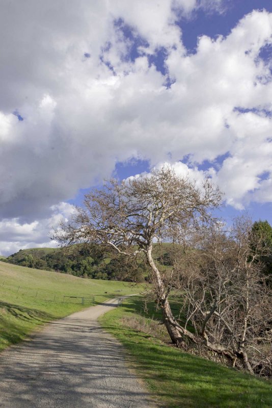
As I looked at the firehose of photos on the internet I could see a commonality in the minimally processed images. The images were all dark in the shadows and low midtones, much of the greenery was dark and not very green and the shadows on grass and trees were very blocked. Many of the images had clouds that were very ill defined in the highlights. Full sunlight was rendered poorly with deep shadows and blazing highlights.
I had to downgrade myself criticism to “it’s not me it’s everybody”.
I perceive that the reproduction curve of the monitor is different from the printer. By this I mean that the monitors show far more shadow detail and render the low midtones lighter than in a print. This has to do with the gamma of the monitor which affects how midtones are rendered.
I calibrate my monitor using an eyeONE sensor and DisplayCAL. DisplayCAL is an open source profiling software that supports most sensors using the ArgyleCMS engine.
Download DisplayCAL - https://displaycal.net/
The Magic Lantern Effect…

With film we would always look at transparencies on a light table and marvel at the color and contrast. It didn’t go much further than that because offset lithography would usually kill anything and the internegative to ‘C’ print workflow was worse. An ‘R’ print on Cibachrome had good contrast but still did not represent the light table experience and crushed the already challenged shadows in the transparency.
This was the Magic Lantern, 70’s style.
Trans-illuminated high contrast media which looked good and reproduced poorly without heroic efforts.
Fast forward 20 years and we have the Magic Lantern 2019 style.
A backlit phosphor display with a fairly high contrast ratio… Different day, similar problem.
In these conditions it is all too easy to “get on the gas” and to overrun the limits of the print while looking fairly acceptable on the monitor. It is really a matter of learning what a good print looks like because you can get a range of renditions which look “acceptable” although some will print well and others… less well.
In Short…
What looks good on a monitor or light table may not reproduce well due to the new age Magic Lantern effect of the monitor.
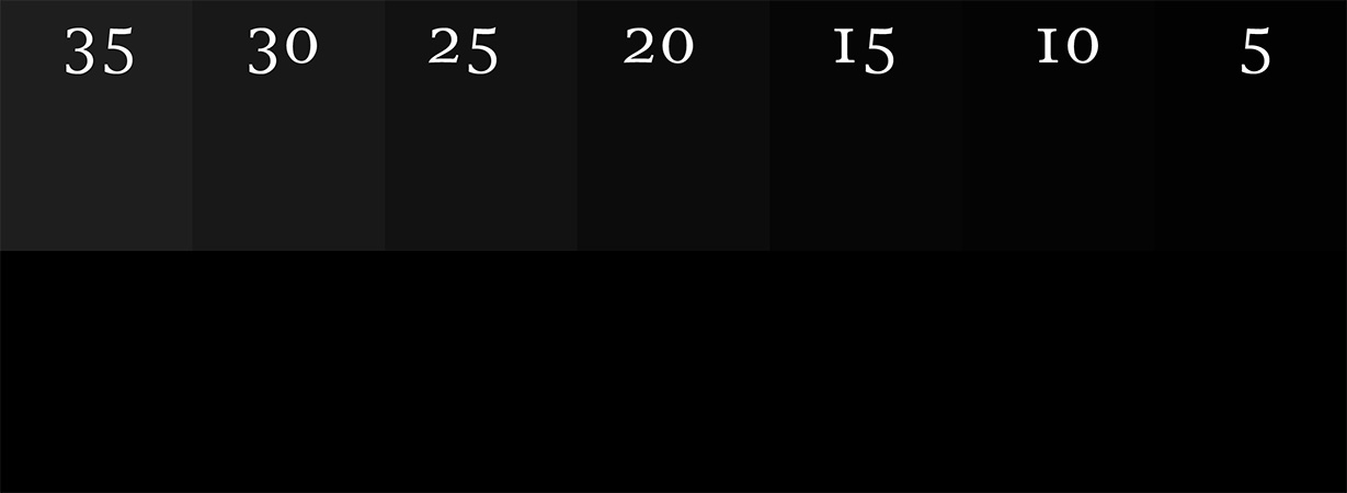
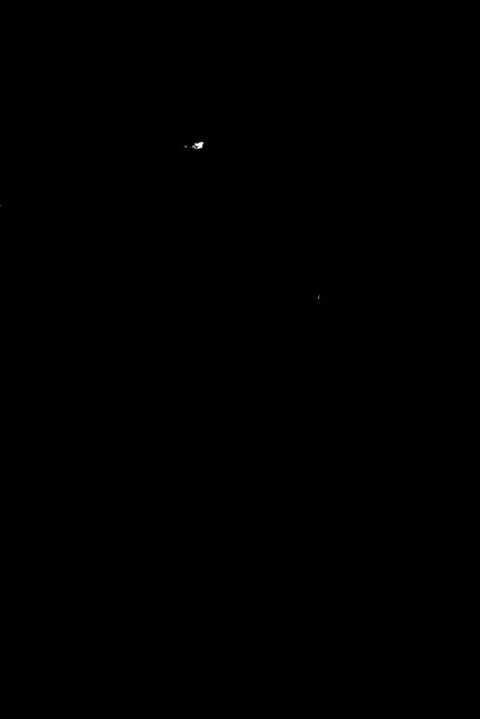
Viewing this grayscale with values from 0 to 18 clearly shows the monitor displaying readable values below 18 the bar on the bottom is black (0).
Aim Points…
If you perform the Profile Extents target test on your printer/media/profile combination you will find that in your print the lowest recognizable value is between 15-20 and the highest between 250 and 255. You can skip this if you like, use my numbers and be quite close.
Aim points are the digital densities that we will set as the highest and lowest values in our printer ready file. I have yet to examine a profile that renders values below 15 so that is a good rule of thumb for a low aim point. Most profiles stop laying down visible ink in the 253-4 range
Low: 15
High:253
If your output image has values below 15-20 they will not be rendered in a print. This also will cause all of your shadows to be noticeably darker.
Properly targeting the extents of the final master for the desired output process is the first step towards better prints.
In the raw smart object I am happy if my shadows are above 0 and my highlight is 245. This allows me to adjust the range of my raw pixels to meet my aim points of 15 and 253ish. It is important to allow this headroom. If you expand the contrast range of the raw file to hit 0 or 255 you will be losing values.
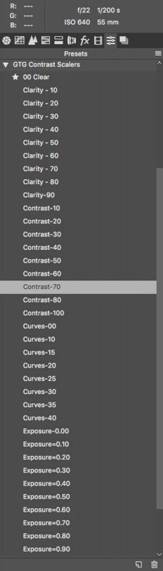
The Presets…
After months of trying different settings I found a fairly anti-intuitive pattern that got maximum detail and separation in the highlights while boosting up and defining the low zones.
I made these settings into an ACR Preset Group that you can download and install. This greatly expedites the contrast scaling process.
The benefits of using the Contrast preset is that it pulls back the highest highlights creating more separation in the high highlights while bumping up the midtones. In the scaling process I use most of the dynamic range 10-245 and validate that using color samplers in my raw smart object.
I am always trying to get more light into my images and this has allowed me to render the midtones lighter then I was before.
- Contrast-xx
- Sets Highlights, Shadows and Whites into a V shape -20, 20, -20
- Curves-xx
- Sets the curves dialog into a compensated curve of varying depths.
- Exposure=xx
- Sets the exposure slider.
- Clarity=xx
- Sets the clarity slider.
Install the Presets...
Download acr-contrast-scalers.zip
Install the contrast scaler preset group in Photoshop. It is Photoshop and LightRoom compatible.
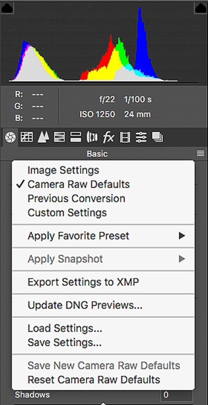
These presets change only specific settings so that they can be used cumulatively. There is a preset at the top called 00 Clear. This preset will clear the Highlight, Shadow, Whites, Curves, Clarity and Exposure.
Photoshop
- Download the file acr-contrast-scalers.zip
- Dont unzip the file as it will be will be loaded as a zip by ACR.
- Open a raw file in Bridge or Photoshop, ACR will appear.
- Select the Presets Tab
- Click in the three lines on the right to open the local menu.
- Select Load Settings…
- Navigate to the file acr-contrast-scalers.zip and hit Load
- The new preset group will appear in your menu of preset groups
Lightroom
- Download the file acr-contrast-scalers.zip
- Open File -> Import Profiles & Presets
- Navigate to the file acr-contrast-scalers.zip and hit Import
Scaling an Image…
My initial goal is creating an opening color and contrast grade to provide a starting point for editing.
Adjust the color balance to taste. Set the white point and tint either by using the gray eye dropper or by selecting the appropriate white point then waving the tint back and forth to find the magenta->green balance point.
Open your raw file in ACR and select the presets.
Start with the Contrast…
Use the Contrast preset first. If further reduction is needed use the Curves in conjunction with the contrast preset.
Wave your mouse pointer over the Contrast-xx settings. You will see the image get darker and flatter. When it looks good click on the preset. The click makes the setting change to the presets value. As you make the image flatter it will get darker because the overall scale of the image is being compressed.
Makeup the Density…
When you pull the highlights down and lift the low midtones your image will get darker and flatter. Use the Exposure presets to add some makeup gain.
Wave the mouse over the Exposure presets until you have good looking highlights. When it looks good click on the preset. I put out a color sampler on the main highlight and look for it to be around 245. The numbers will work if the main highlight was white in your original image. Some images do not have a white value. In that case it calls for a visual evaluation of the highlight density.
Revisit the Contrast and Exposure…
Return to the Contrast and adjust further, if necessary, cycling back to the Exposure as needed.
If you get to the Contrast-100 setting and the image still has too much contrast start on the Curves presets and reduce contrast further as necessary.
Pump up the Detail…
Once a reasonable scale has been achieved add some clarity to further enhance mid-tone contrast.
Load as a Smart Object…
Open the raw file as a smart object in Photoshop. This will allow you to further adjust the image non-destructively.
Locate the Highlights and Shadows…
- At the top of your stack of layers.
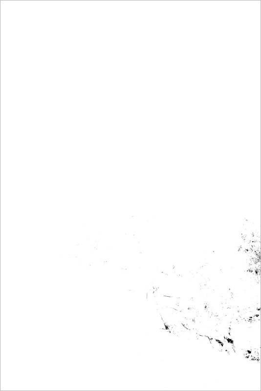
- Add a Threshold layer
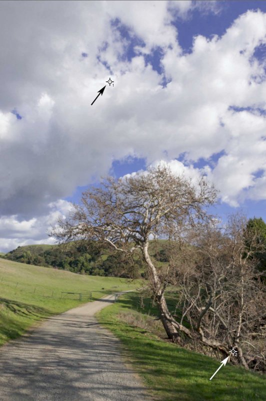
- Set the Threshold to 250 to find the highest highlight.
- If it is not specular or blocked put a color sampler there.
- Blink the Threshold on and off to see the image regions that it delineates.
- Wave the Threshold setting around 15 to find the lowest shadow.
- Put a color sampler there.
- Blink the Threshold on and off to see the image regions that it delineates.
Identify the lowest Shadows…
- Add a Levels layer below the Threshold layer
- Set the Threshold layer to 15
- You should see a white field with areas of black.
- If there are areas of black
- Adjust the Levels->Output Level->Lo to 15
- This moves your shadows up so that they start at 15.
- If the image is all white.
- Adjust the Levels->Low slider up until you see some areas of black.
- This moves the shadows down to hit 15, full black.
- Blink the Threshold on and off to see the image regions that it delineates.
Identify the highest highlight…
To do this we must first evaluate the highlight. If it was white in the original scene its very easy. Simply adjust to the high aim point and smile. If that is not the case you should adjust the highlights visually.
- Turn on the Threshold to use the numbers, it should be off for a visual adjustment.
- Set the threshold to 250
- In the Levels layer set the high slider until the highlight is in the low 250’s.
- The image will appear as all black with specks of white.
- Blink the Threshold on and off to see the image regions that it delineates.
- This can often reveal the one hot spot that is preventing you from making the entire print lighter.
- Often in this step I can knock the highest highlight down 10-20 points and get more highlights and more light and color in the rest of the image.
There are many other settings in addition to burning and dodging that you can add in to finish an image and they can be added to taste to complete your post cycle…